WHAT WE ACHIEVED
2-3x
increase in live video starts
live sessions averaging notably longer watch time than VOD (often 1.5-2x)
+2.3
videos per session
average lift in videos watched per session
12%
engaged in chat feature
total chat messages per stream into the thousands for primetime games
32%
total video views were vertical
Our net new video feature setting a baseline for viewership
8%
increase in weekly active users
in the first 3 months of new design launch
THE CHALLENGE
Introducing new social features, designing net new veritical video formats, improving our current experience, all while meeting business goals.
Bleacher Report's video product hadn't kept pace with how fans actually wanted to watch. Mobile, vertical, and live were becoming the norm, and fans wanted to feel social and connected even while watching alone. The redesign had to solve for both shifts at once, across four distinct formats, without breaking the experience as fans moved between them.
Business Impact
B/R sits against ESPN, and increasingly against social platforms like TikTok for how younger fans actually consume sports. Closing the gap on vertical and live video protects B/R's relevance with that audience instead of losing them to platforms built video-first from day one. In addition to retention, community and social engagement leads to natural user aquisition through sharing between users and non-users.
Improving Video experiences and lowering barriers for entry on community/social engagement drives retention, directly affecting value of B/R for ad placement and partnerships.
My Role
As the Senior Product Designer leading this effort, I owned the onboarding experience end to end, from initial strategy through shipped product. I partnered closely with UX research, data analytics, product management, engineering, and a UX copywriter to make sure every decision was grounded in both user insight and technical reality.
The Scope
The scope was broad: we needed to redesign the entire video viewing experience across live and on-demand content in both horizontal and vertical formats. The UI across both would need to be updated to reflect new features and be inline with our new design system. Additionally, gestures would need to be determined to to work across both. Live vertical video was entirely new for Bleacher Report, and live horizontal streaming required structural change for the quality level we were targeting. Both required deep collaboration with engineering to understand infrastructure constraints and build experiences that could actually ship.
I also designed the social integrations: how reactions, comments, live chat, and polling overlaid the video without disrupting the watching experience. This was some of the most nuanced design work in the project because it required balancing maximum engagement with minimum distraction.

Discovery & Definition
Testing with limited access to users, defining personas, shaping project goals & requirements
At the time of the B/R 2.0 redesign, Sports & Entertainment did not have a dedicated UX Research team so we had to get creative and dust off our own research chops. I partners with Data & Analytics to collect all the stats we could on our 1.0 horizontal player experience as well as conducted my own competitve analysis across sports specific video experiences and popular video apps generally.
I knew our video controls were going to need approval from the HBO Max video player team so I tracked them down earlier in the process and they shared a breadth of historical user testing and findings with me that helped to shape our user personas.
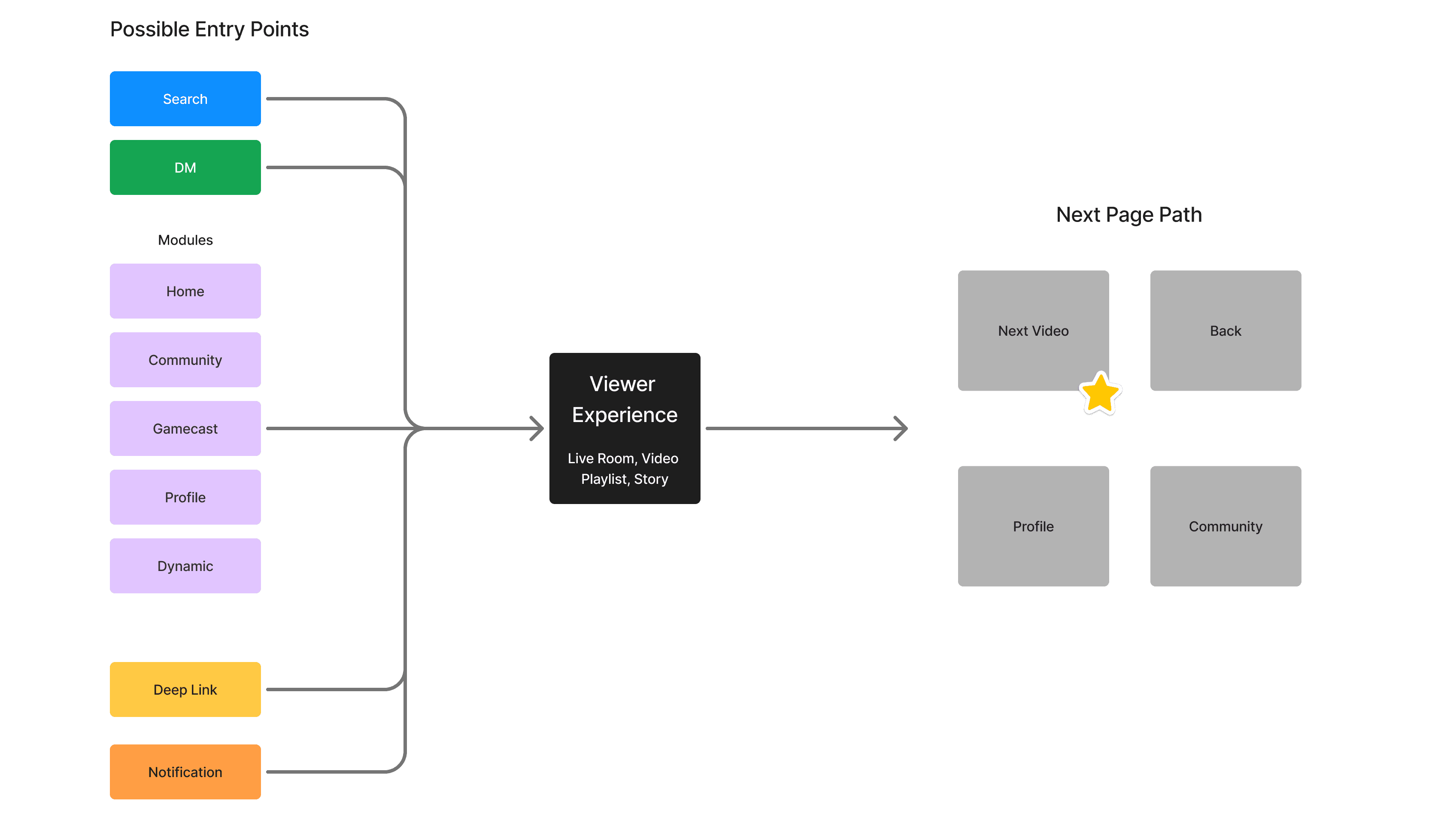
The personas drove the direction of the flows which guided the ideation and begin the wireframing.

Video Player Anatomy
Goals
Provide a Consistent Experience Across All Video Types
Encourage Full Participation
Make it Easy to Discover Video Content
Design an Experience that Feels Engaging, Immersive & Alive
MVP Launch
Meeting Uncontrollable Cirumstances with Patience and a Plan for Iteration
For MVP Launch, our team had to make a tough decision; two sprints before launch, our vertical video experiences wasnt working about 30-40% of the time anytime social features were interacted with in stage builds across iOs and Android. With only a handful of weeks before launch, Product pulled social features from vertical video from the MVP launch with the hope that it would be in the next release the following month. This came with the risk of users seeing vertical video without social features, not seeing the full value of the content and then not returning.
What Launched
Horizontal video viewing experience accompanied by a playlist of related content, autoplaying the next video in the list. Video controls appearing on tap. The ability to fire, comment, reply (in an expandable comment sheet) and share the video. The video creator avatar having a follow button for quick access.

Key Screens
The horizontal viewing experience had video controls on tap. The comment sheet expanded to a scrolling view beneath the video player. A. small win was bringin in GIFs to make fun, playful environment for B/R users. Replies appear within a thread defined by a section linebetween the replied comment and the end of the thresd.

Design Decisions
Originally, I wired the horizontal experience to function similarly to the virtical, where you could swipe through a playlist of videos but upon further testing of prototypes, I landed elsewhere. Horizontal video has the video player sticky to the top of the screen, with the social controls beneath it and the a playlist of related content. The user research and our content library points to the fact here being that horizontal video is often times longer form content than vertical and therefore, doesnt need swiping inbetween videos to be the prompted behavior. Instead we prompted social interaction with the partially exposed chat and content exploration witht he playlist of related content.
Ad Banners
Horizontal video, vertical video, and polls pushing for ad revenue
With 2.0 launching an intentionally improved video experience backed by the HBO Max video player and the word of WBD Executive, Ad partenerships were required before success was even determined for the viewer experience. We designed a way to subtly but distinctly advertise across our various video types and social features.

Ad Banner across Horizontal Videos
Vertical with Social Launch
Successfully tying together the last of the social integrations into our video experience ecosystem
The next month B/R launched vertical video with social integrations. Users could fire videos, comments, reply, and share the video with friends outside of B/R.
Design Decisions
Originally, I wired the horizontal experience to function similarly to the virtical, where you could swipe through a playlist of videos but upon further testing of prototypes, I landed elsewhere. Horizontal video has the video player sticky to the top of the screen, with the social controls beneath it and the a playlist of related content. The user research and our content library points to the fact here being that horizontal video is often times longer form content than vertical and therefore, doesnt need swiping inbetween videos to be the prompted behavior. Instead we prompted social interaction with the partially exposed chat and content exploration witht he playlist of related content.
What I Learned
Designing for layered interactions and how to approach a new company's business goals
The complexity of this project taught me a great deal about interaction patterns that happen in layers. In this project, we had to prioritise interations and make second layers of interaction unobtrusive but discoverable. There is a valuable difference between what is going to meet goals for an improved experience and what is best design practice. It's easy to add interactions. It's much harder to decide exactly when and how they appear so they feel natural rather than intrusive. The approach we landed on was the right call, but it took real conviction to advocate for it.
