B/R Onboarding
Designing the first touchpoint that turns a new user into a loyal fan.
Over half the users that download the Bleacher Report app drop off and ~70% of them never return, killing growth, retention opportunities, personalization, and business goals. I led a redesign of Bleacher Report onboarding for mobile to convert first-time app downloads into active users.
Role
Senior Product Designer
timeline
October 2025 – January 2026
THE PROBLEM
64% of users drop out of Bleacher Report either at app open or during onboarding and 70% of those users never come back because they find onboarding confusing and do not see the value in the process (personalization).
The problem was clear: our existing onboarding experience was losing people before they ever had a chance to build a relationship with the app. Our drop-off rate told us we were asking too much too soon and giving back too little in return. Notification opt-in sat at 66% among active users, yet we weren't surfacing it during onboarding at all. Registration was a tiny button at the top left of the page with no incentive. Both the user and the business were losing out on value before the app even opened.
MY ROLE & SCOPE
As the Senior Product Designer leading this effort, I owned the onboarding experience end to end, from initial strategy through shipped product. I partnered closely with UX research, data analytics, product management, engineering, and a UX copywriter to make sure every decision was grounded in both user insight and technical reality.
The scope covered the full onboarding funnel: the entry point, team and topic following, notification opt-in, account sign-in, and the in-app success state. Related touchpoints like search, in-app following prompts, and alert prompts for users who skipped onboarding were included in the broader project but for the sake of this case study, we will strictly be going over the onboarding flow.
RESEARCH & DISCOVERY
I kicked off the project by partnering with our UX researchers and data analysts to make sure we were solving the right problem before designing anything. Together, we combed through user research from previous WBD product launches, competitive onboarding benchmarks, and our platform's own behavioral data.
The data painted a compelling picture.
Our onboarding completion rate was sitting at just 22%
64% of drop-offs were happening right at the entry point, with only 30% of those users ever returning to try again
66% of active users had opted into notifications, but we weren't even surfacing that prompt during onboarding
Users following two or more communities were 70% more likely to retain as a monthly active user, yet most new users were never getting far enough to follow anyone…
Breakdown of our current experience & pain-points:

UX Research conducted over 12 user interviews, sent out over 500 surveys and pulled previous onboarding research from other WBD teams to deliver incredibly thorough documentation of findings.
Copilot allowed us to fast-track the data synthesis and deliver weeks worth of work compiling findings in just days. Our AI-powered assistant summarized the most common patterns that motivated our users, allowing us to create 4 key personas. Our user personas helped us to better understand what users wanted at face value and what they needed from an app like Bleacher Report; both are critical in converting to active users.
Key findings:
Over 80% of interviewed users expressed a want for "relevant communities", "teams I care about", and "teams in my area" to be surfaced in onboarding. This suggested an emphasis on local teams and a possible opportunity to use generative AI algorithms to produce suggestions.
In live user testing, we only held user's focus in onboarding for about 2 minutes and 40 seconds. What does this tell us? We need a quick, onboarding process with few steps that require low cognition.
Users were hesitant to turn on notifications after selecting their teams and sports, make statements such as,
"Am I going to get spoilers for all my teams now that I've followed them? I don't get off work till late at night and I record the game, I don't want my phone blowing up with the scores before I can watch the game." (Aaron, 34, fast food worker & Bleacher Report desktop user),
so we either needed to:
Be clear about what general notifications were when you opt into them AND that they are customizable in the app
Allow the users to customize what notifications they opt-in for *to an extent* in the onboarding process
THE DESIGN PROCESS
Bleacher Report is Warner Bros. Discovery's flagship sports media platform, serving tens of millions of fans with original content, expert analysis, live scores, and personalized highlights. Personalization has always been at the core of where Design wanted to take the product, and onboarding is the very first moment a new user gets to tell us who they are and what they care about.
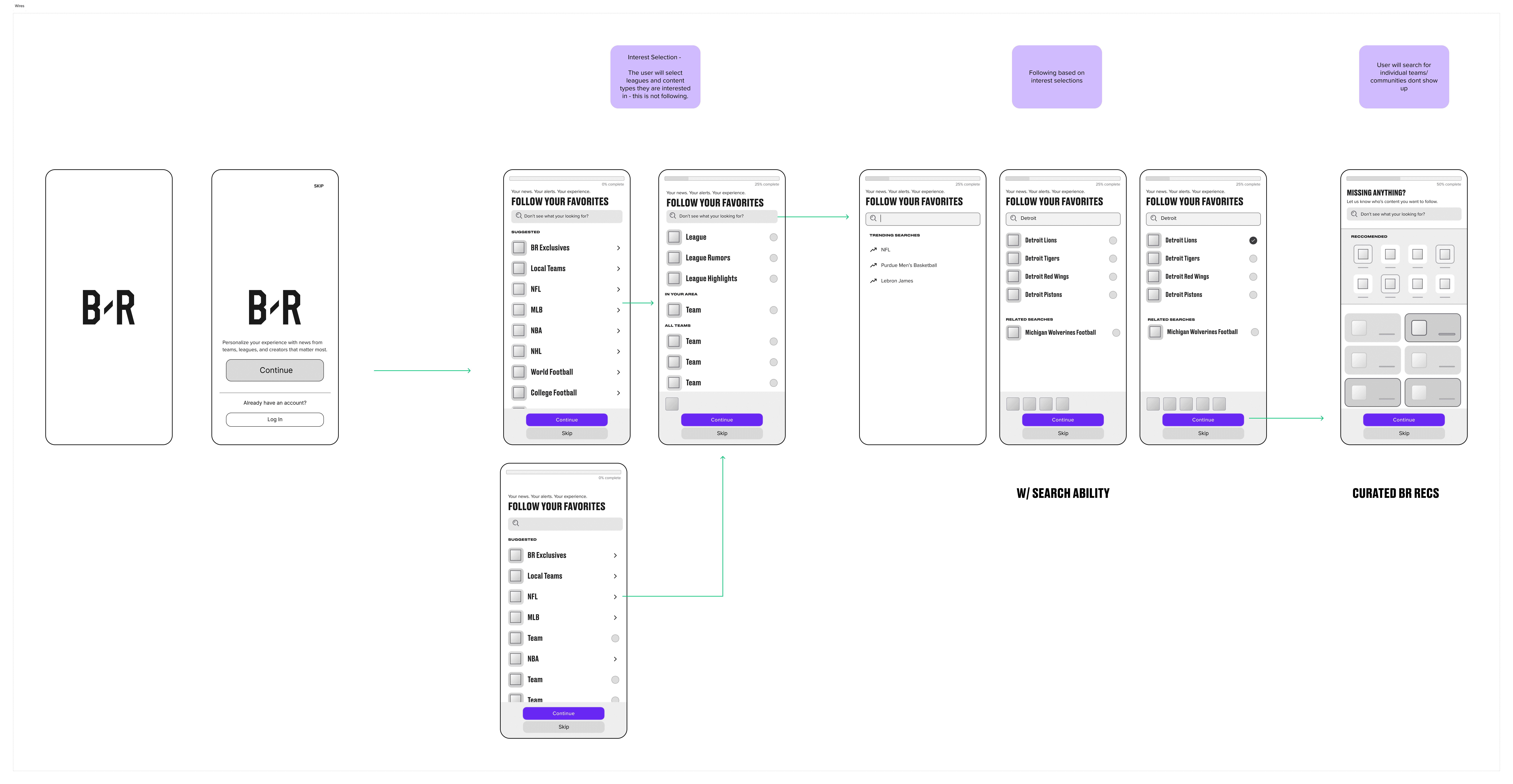
With our research principles locked in, I moved into wire-framing and rapidly iterated the structure of the flow. I went through several rounds of user flow mapping, wire-framing, and strategy alignment before landing on 3 solid directions. Collaborating with my design team allowed me to narrow down a solution that confidently covered all use cases while maintaining a low cognitive load for the user.
Wire-framed flow iterations:

Where we landed:
Now that we had a structure I was confident in, I brought in our engineering team to pressure-test ideas against feasibility, and I advocated for the experience and best design practices in those conversations.
Where can we use dynamic imagery? Where can we begin using AI-powered suggestions? What are the absolutely necessary system screens and can we change the actions that trigger them?
Before we negotiated engineering effort and design necessity, I made sure I knew what was absolutely necessary for launch versus what was considered best design practice.
Necessary:
Search
Progress Indicator
Skipping
In-App Success
Notification & Registration Opt-In
Post MVP
Dynamic Imagery and Copy
AI-Powered suggestions
Notification Customization
Not everything made it through, but having engineers in the room from the start meant we avoided some costly surprises later.
Once we had a strong direction, I built out high-fidelity prototypes that I could test and refine. After rounds of internal review and stakeholder feedback, the final designs went through executive alignment with our Sports and Entertainment leadership board before being handed off to engineering for delivery.
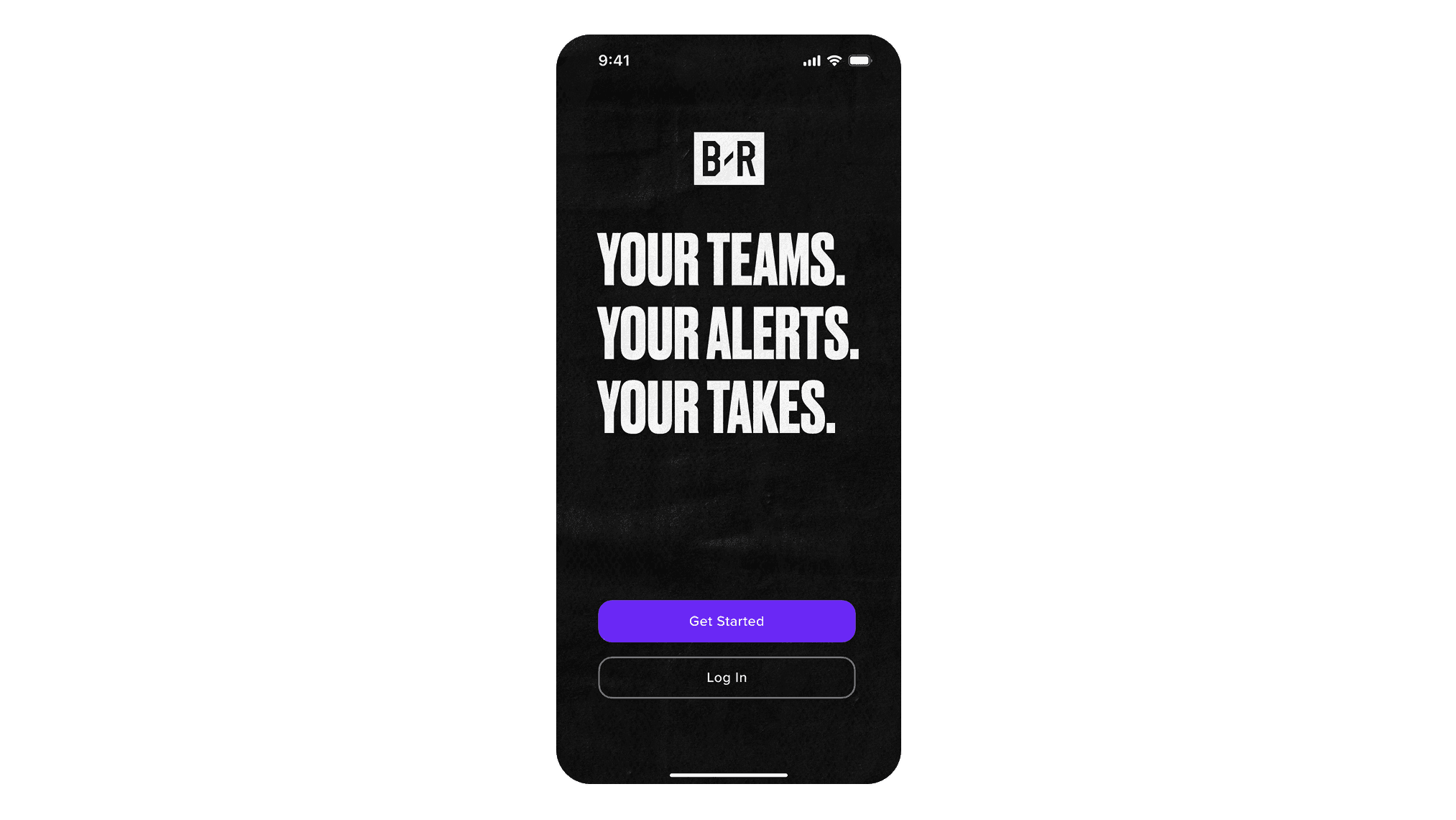
WELCOME
Net New: Currently no precursor to Onboarding
Bold Value Prop: Establish purpose & provide identity
Clear CTA Hierarchy: Onboarding is priority, Log In is second (US Only)
B/R Brand: Dark, textured, bold, heavily branded
Design Goal
Keep cognitive load low while being engaging and distinctly B/R.
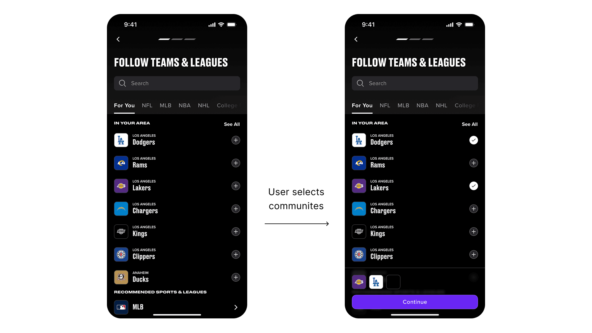
ADD COMMUNITIES
Persistent Page Controls: Skip & Back controls added to each page, along with a step indicator added to the active onboarding steps
Emphasized Search: Search bar made more accessible and visible (improved search logic pushed for prioritization)
Geo Location: Industry standard and popular use case
Cart Appears with Action: Empty state of cart removed, only appears on first community addition
Challenge & Design Advocation
This was a page that everyone wanted a say in; Content, Social, Execs, Product, etc. I pushed for our ideal design due to it being heavily UX Research driven; comp analysis, user testing & pulling past and other platform data.
Content Compromise
While the design itself did not wander from our proposition, the content that would fill the page did. We resulted in surfacing all available teams & leagues within the tab structure instead of our idea to surface a limited amount.
Engineering Requirements
Aligning on persistent nav allowing for saved changes throughout page skips which would be a new pattern. Engineering deemed this high LOE and asked for it to be omitted from requirements but both Design and Product pushed for saved changes to be included as it presents the obvious benefit of retaining personalization of the users who only completed some steps of onboarding.
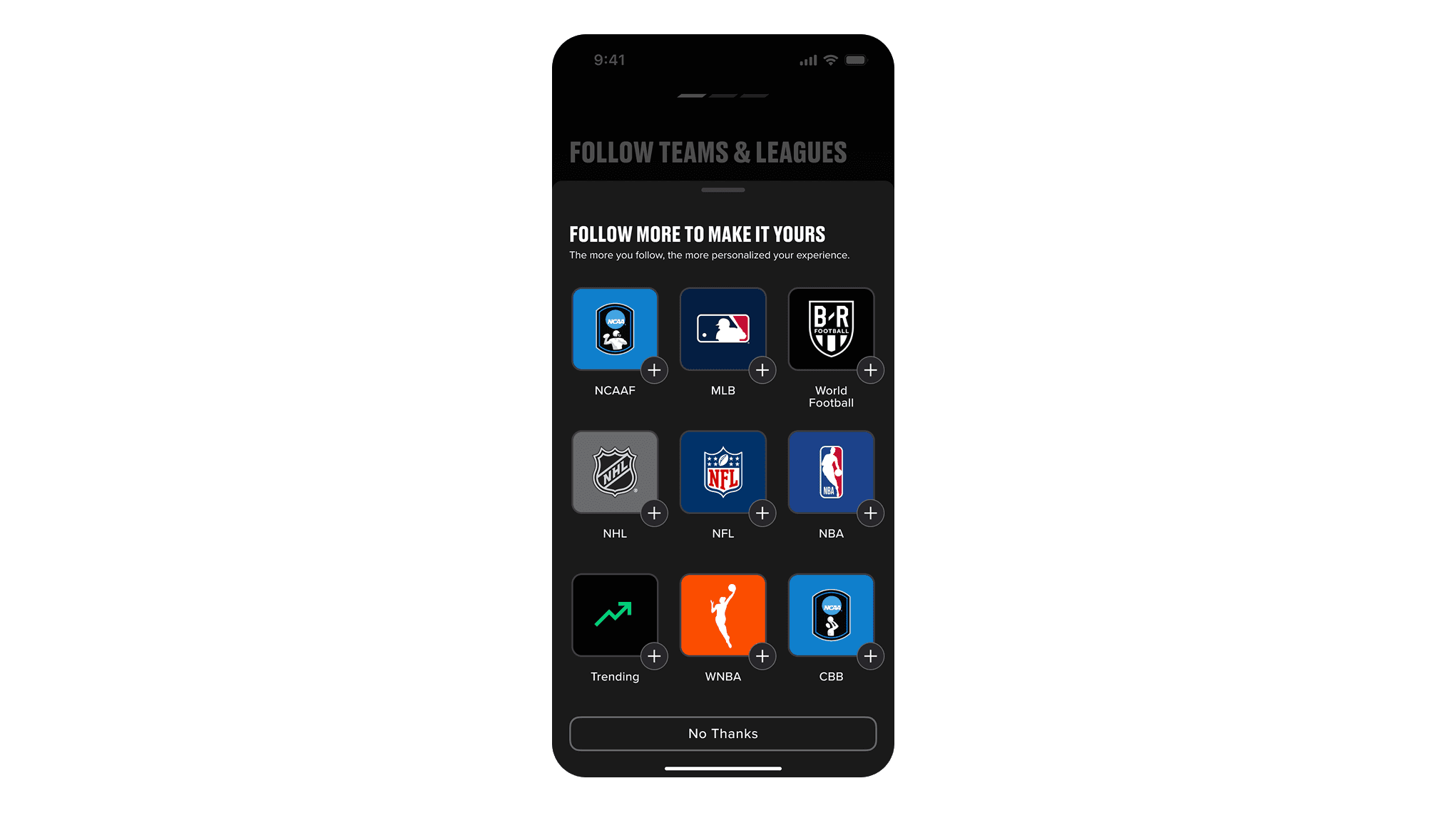
COMMUNITY UPSELL
High Reward: Users are more likely to convert and retain if they have >2 communties followed
High Risk: Users will possibly see this as an extra step and find irritation with a company 'upsell'
Easily Dismissible: Swiping Sheet and CTA
Simple: Chips based on anything you've chosen/popular communities that haven't been surfaced
Personalization: Opportunity to use generative Al algorithms (combo of previous picks, location & popular communities)
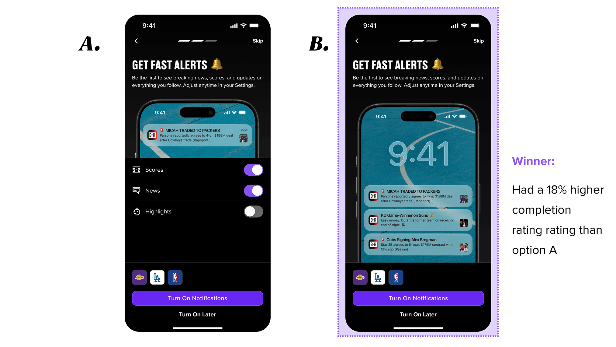
NOTIFICATION OPT-IN
Looping Notification Animation: Mix of notifications based on communities you chose to follow (programmed generic will be default)
[A/B TESTING] Exposed General Notifications vs. Imagery: Allow notification optimization encouraging Opt-in or rely solely on imagery
Persistent Cart: Enforces the relationship between followed communities and personalized notifications
ENGINEERING REQUIREMENT
This will appear before the iOs/android system modal to give users the opportunity to customize before system level permission allowing them the chance to understand why they would want to do so.
Assumption
Option A: Users don't turn notifications on because they think they may be bothersome and irrelevant to their specific interests.
By presenting them with the ability to personalize their notifications and imagery displaying the type of notification they will receive will motivate users to opt into notifications. However this does present a greater mental load than the singular action of turning on all general notifications.
Notes from Reviews
Executive & Product counterparts would like to test this and an image/animation only version (no preference selection)
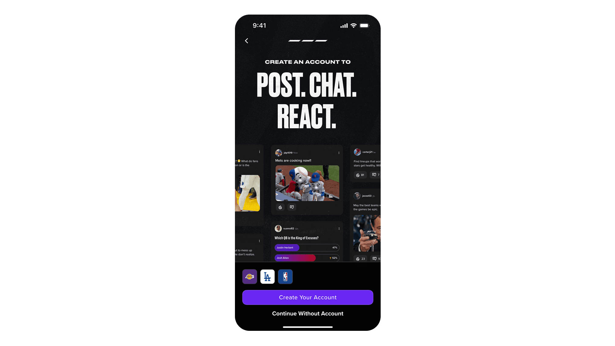
REGISTRATION
Net New: Currently no distinct path to Account Registration
Bold Value Prop: Establish purpose & enforces identity
Imagery & Animation: Abilities of an account holder (react, comment, polls)
Persistent Cart: Enforces the relationship between followed communities and creating an account (saved preferences)
Design Decision/Compromise
Amplify the Brand: Executives want to see the images & animation feel more 'alive' so we worked with our visual designer to come up with some more flashy, even though we didn't think it necessary for the success of the experience.
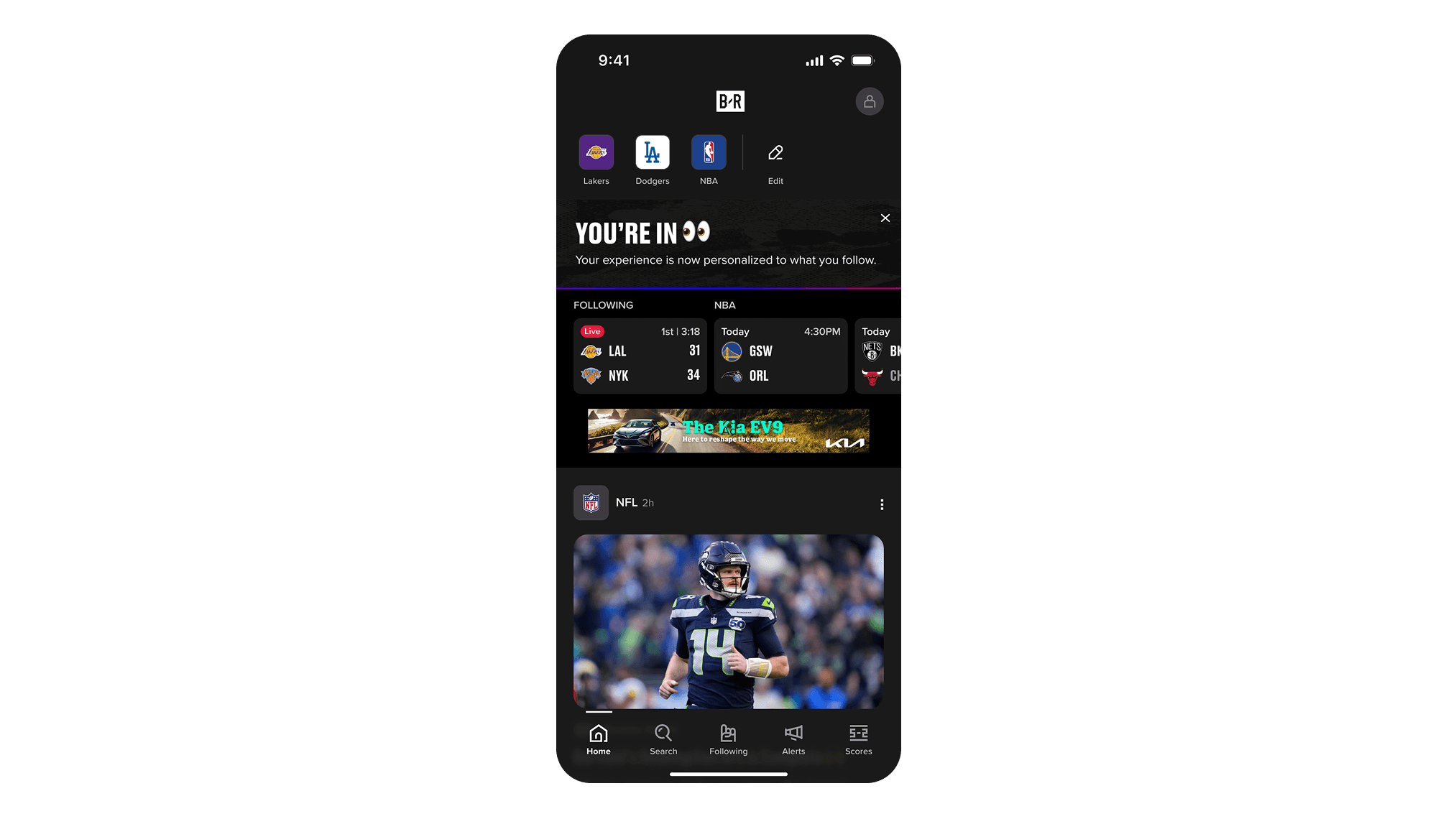
ONBOARDING COMPLETION
Net New: Currently no confirmation of completion or saved preferences
Discreet & Dismissible: Single visit appearance, timed to dismiss, clears on scroll & tap to dismiss.
Design Decisions
Low Cognitive Load: Completion banner is non-blocking; it celebrates the moment without interrupting the feed experience.
Continuity: Team logos selected in Add Communities appear immediately in the top nav, creating a direct feedback loop between setup choices and the live app.
OUR SOLUTION
After many rounds of user flow mapping and wire-framing, the solution came together as a focused three-step process: Following, Notifications, and Account Opt-In. Sandwiching those three core steps are an Entry Point that explains the value of onboarding up front, and a Success State that celebrates the user and sets expectations for what comes next inside the app.
The entry point does the heavy lifting of motivating users before they've committed to anything. It gives them a reason to keep going. Each step that follows is designed to feel low effort and high reward, with clear progress indication throughout and the option to skip at any point without friction.
The result is a flow that respects the user's time while giving the product the signals it needs to start personalizing their experience from day one.
I also worked hand-in-hand with a UX copywriter to make sure the tone, phrasing, and microcopy inside every step felt warm and motivating, not like a chore. And I collaborated with content and marketing teams to make sure the dynamic imagery and prompts throughout onboarding felt cohesive with the broader Bleacher Report brand.
RESULTS & IMPACT
Onboarding shipped in late January 2026. The new three-step flow gave us a cleaner, more motivating entry point and surfaced notification opt-in for the first time during onboarding.
Onboarding completion rate increased from 22% to 39%
Notification opt-in during onboarding reached 52%, giving us a new baseline
Drop-off at the entry point decreased from 64% to 38%
Average user following count increased by 26% within the first session
The new system was also designed to be modular and adaptable, making it the foundation for rolling out onboarding across other WBD Sports brands beyond Bleacher Report.
What I Learned
This project taught me a lot about the power of data-informed storytelling inside the design process. The numbers were the most persuasive tool I had, not just with stakeholders but with my own decision-making. When you can point to 64% of users dropping off at a single screen, it stops being an opinion and starts being a mandate to fix it.
I also came away with a deeper appreciation for how much microcopy and tone matter in an onboarding flow. The words inside each step needed to work in tandem with the visual design. Bringing in a UX copywriter early, rather than treating copy as a final step, made a meaningful difference in how the final product felt.
Finally, building for scale from the start, designing a system that could flex across WBD Sports brands instead of just solving for one, made the project feel more meaningful and made the final output more valuable to the business.
