B/R Viewer Experience
Reimagining how fans watch, react, and connect through live and on-demand video.
Role
Senior Product Designer
timeline
October 2024 – December 2025
The Challenge
Bleacher Report had two strengths it had always led with: great sports content and an active, opinionated fan community. What it lacked was a video experience worthy of either.
In February 2024, I took on my first large-scale redesign at Warner Bros. Discovery, a complete overhaul of the video viewing experience on Bleacher Report. The platform had grown quickly but the video product had not evolved with it. Fans were watching on their phones more than ever, vertical video was becoming the native format for a new generation of sports fans, and live streaming was increasingly where audiences expected to watch the action, but the app wasn't built to deliver any of that well.
The challenge wasn't just technical, it was about making watching feel social, immediate, and personal. Fans wanted to react, comment, and experience games together, even when they were watching alone. And they expected a seamless transition between their phone and a screen, between watching live and catching up on demand, without losing their place or their experience context.
This project set out to close that gap across every video format: live horizontal, live vertical, VOD horizontal, and VOD vertical, each with its own viewing context and fan behavior to design for.
MY ROLE & SCOPE
I was the lead designer on the Viewer Experience redesign, working in close partnership with product managers and engineers from day one. This wasn't a project where design worked in a silo and the spec handoff was the first time engineers saw the final solution. We both were in the room for every product decision, helping define the strategy as much as the interface.
The scope was broad: we needed to redesign the entire video viewing experience across live and on-demand content in both horizontal and vertical formats. The UI across both would need to be updated to reflect new features and be inline with our new design system. Additionally, gestures would need to be determined to to work across both. Live vertical video was entirely new for Bleacher Report, and live horizontal streaming required structural change for the quality level we were targeting. Both required deep collaboration with engineering to understand infrastructure constraints and build experiences that could actually ship.
I also designed the social integrations: how reactions, comments, live chat, and polling overlaid the video without disrupting the watching experience. This was some of the most nuanced design work in the project because it required balancing maximum engagement with minimum distraction.
THE GOALS
Provide a Consistent Experience Across All Video Types
Keep the UI consistent across all video types
Reduce cognitive load for users. They can more easily anticipate what features are available and how to use them.
Consistency leads to feasibility and scalability
Encourage Full Participation
Participation can look different across users - watching an entire video, firing, sharing, commenting, call-in, cohost, etc.
Always drive users to the full viewer experience so they are aware of all the features
Reduce friction for users to engage with content without disrupting the viewer experience
Make it Easy to Discover Video Content
Video should be readily available everywhere in the app
Recommendations should be contextual to the user journey
No dead ends - always be driving users to the next video or content
Design an Experience that Feels Engaging, Immersive & Alive
Create an enjoyable experience that uses haptics, motion, sounds, etc. to bring it to life
Bring the energy around sports into the experience and make it feel unique to B/R
Systemize the designs for better flexibility and scalability in the future
Research & Discovery
The design process started with research, and a lot of it. Our UX research team had already gathered insights on how Bleacher Report users were engaging with video, and we supplemented that with a competitive analysis of how other platforms, from YouTube to TikTok to ESPN, were handling the intersection of live sports and social features.
Video discovery across our app competitors:

This was also one of the first projects where our team had access to WBD's AI tools, which I used to accelerate research analysis, synthesize user personas, and pressure-test early concepts!
UX Research conducted over 12 user interviews, sent out over 500 surveys and pulled previous onboarding research from other WBD teams to deliver incredibly thorough documentation of findings.
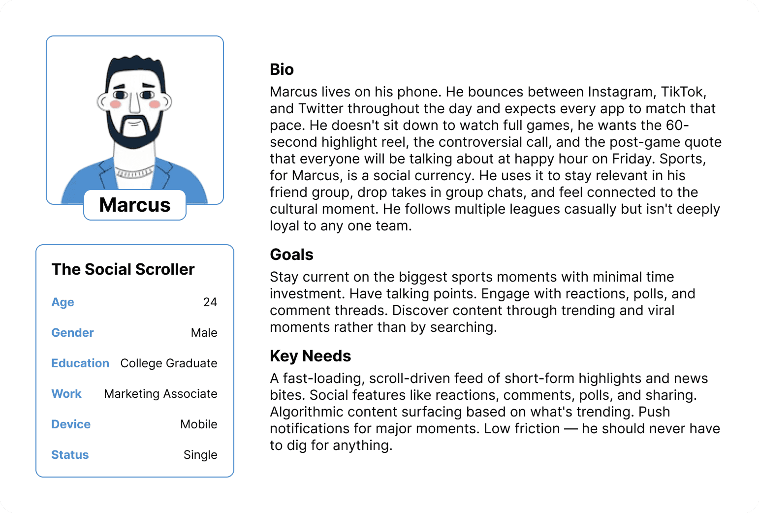
Copilot allowed us to fast-track the data synthesis and deliver weeks worth of work compiling findings in just days. Our AI-powered assistant summarized the most common patterns that motivated our users, allowing us to create 4 key personas. Our user personas helped us to better understand what users wanted at face value and what they needed from an app like Bleacher Report; both are critical in converting to active users.
User Personas:



The Design Process
Ideation & Information Architecture
We started with wire-framing and greybox-prototyping before touching any visual design. I went through multiple iterations of the video player layout for each format before settling on an approach that worked across all four states (Vertical VOD & Live, Horizontal VOD & Live).
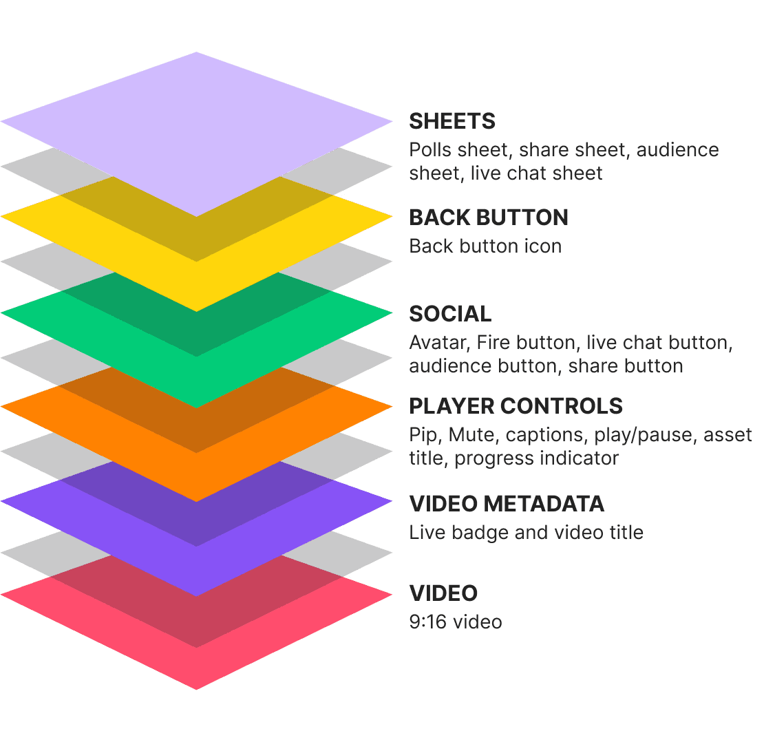
The anatomy of the video player starts with the video itself and then layers on top of that based on depth of interaction. Engineers started with the Metadata which follows a standard pattern and is not actionable. The final layer is any sheet that is triggered which is the deepest, where the deepest layer of interactions occurs - chats, polls, replies, etc.
Video Player Anatomy:
Designing the Layers
Live vertical video was a new canvas entirely. There was no existing Bleacher Report design language for it, so I essentially built one from scratch. I took inspiration from top social platforms' vertical video patterns (TikTok, Instagram, Youtube), but adapted patterns for a sports context where the content is more structured and time-sensitive. The social overlays in the vertical format sit at the bottom of the screen as a semi-transparent layer, designed so they never cover the central action of the video.
The social layer was the hardest design problem. How do you put reactions, comments, live chat, and polling on top of a video without making it feel cluttered or distracting? I explored many directions before landing on a gesture-first model where social features are always accessible but never forced. The overlay responds to how engaged the viewer is, surfacing more social context during high-energy moments like goals or big plays, and pulling back during quieter viewing sessions.
Final set of wires mocking designs for the video anatomy across the 4 types of video for an internal review:

Interaction Design & Gestures
Are their intuitive patterns already in place for video experiences? What will users expect to happen from each action they take? What are the "hidden" ways a user can shortcut actions?
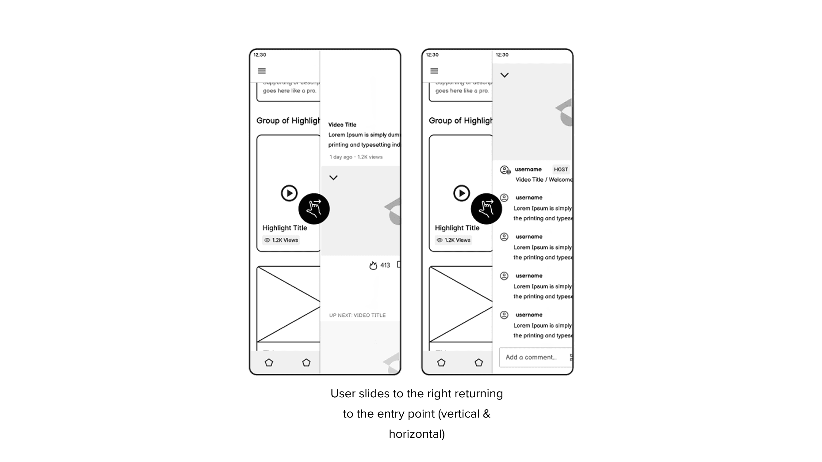
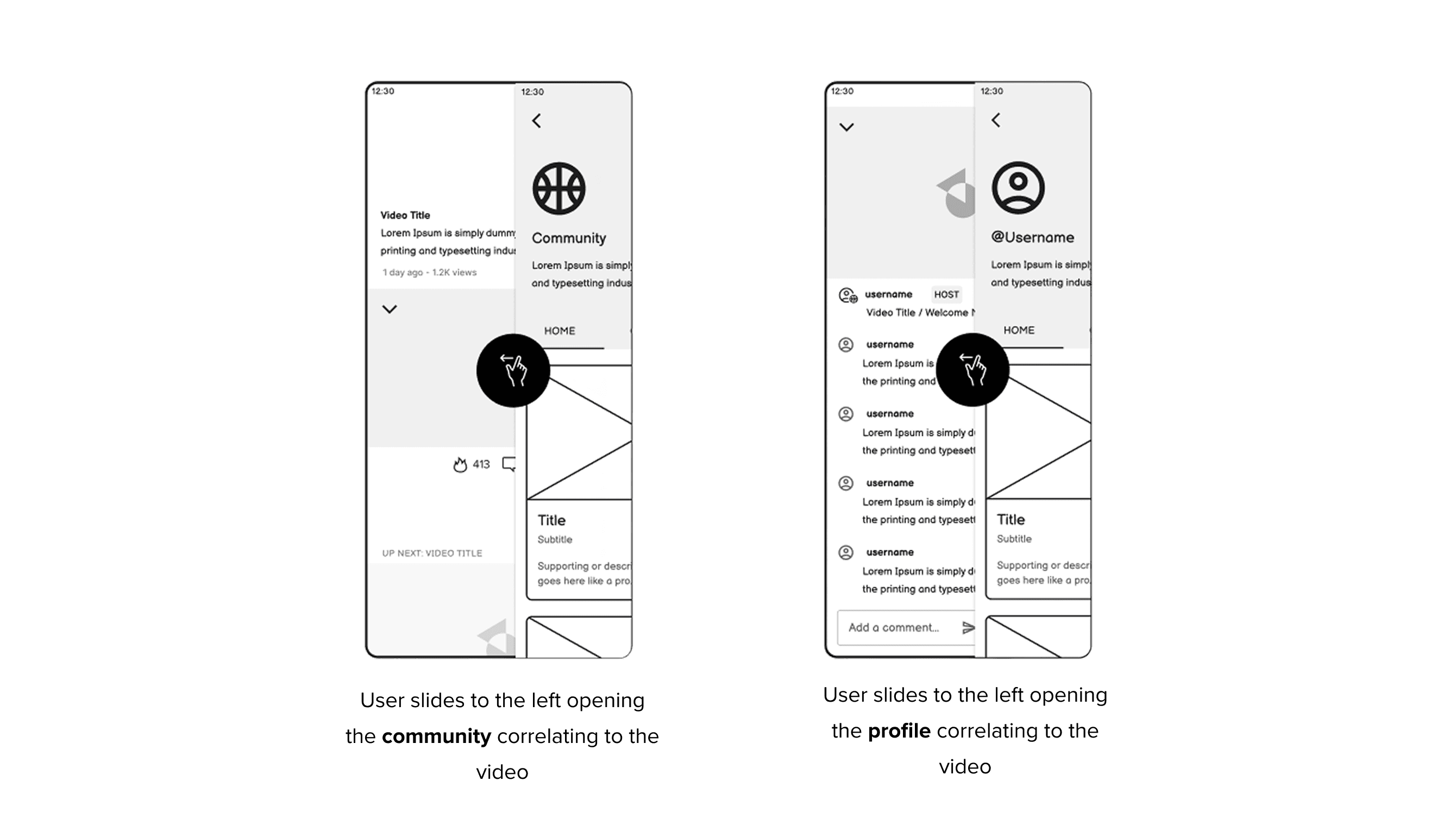
Bleacher Report and WBD in general was behind the game of gestures. Gestures present a simple, fun, quick way for users to engage with videos. Additionally, gestures across video experiences have been well-established in todays world of video-heavy social media. I was thrilled to work with engineering on bringing this life into our video experience.
While delivering and shipping a solid framework for gestures across our video experience made it into MVP launch, there are a few we compromised on cutting due to engineering constraints (for now 😉). The biggest cut being long press including the ability to clear the display for the user - a pattern seen on Youtube and TikTok.
Our core gestures:
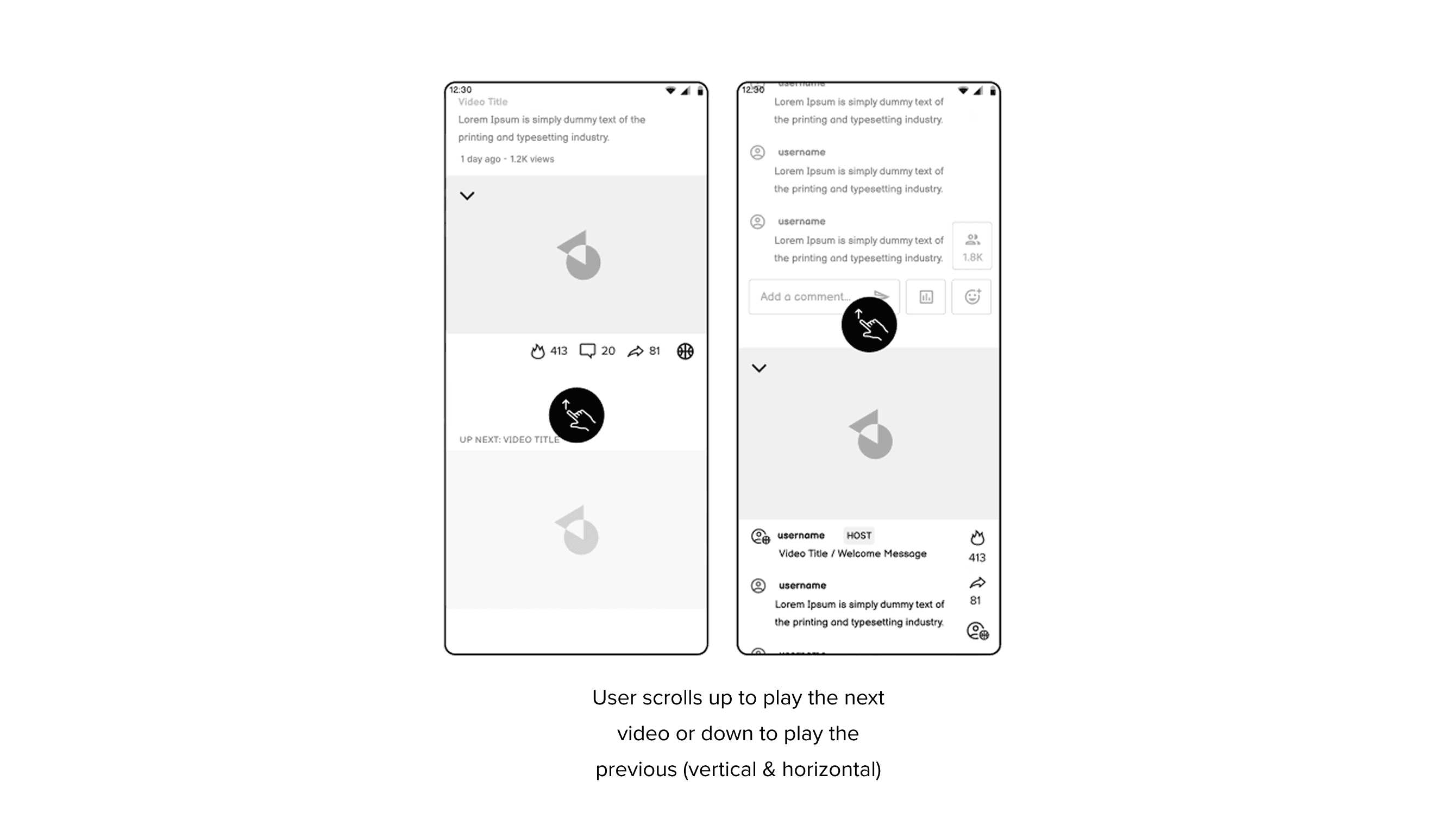
Important Note: During the UI and Visual Design phase of this project, the interaction for the 9:16 video horizontal scroll take a different approach.
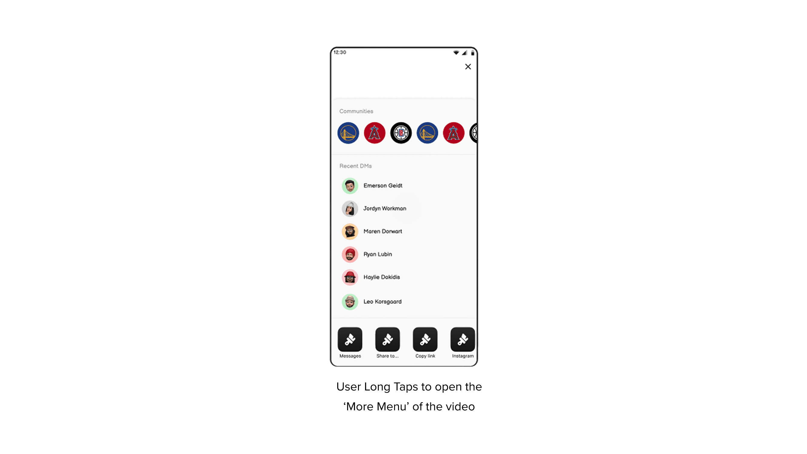
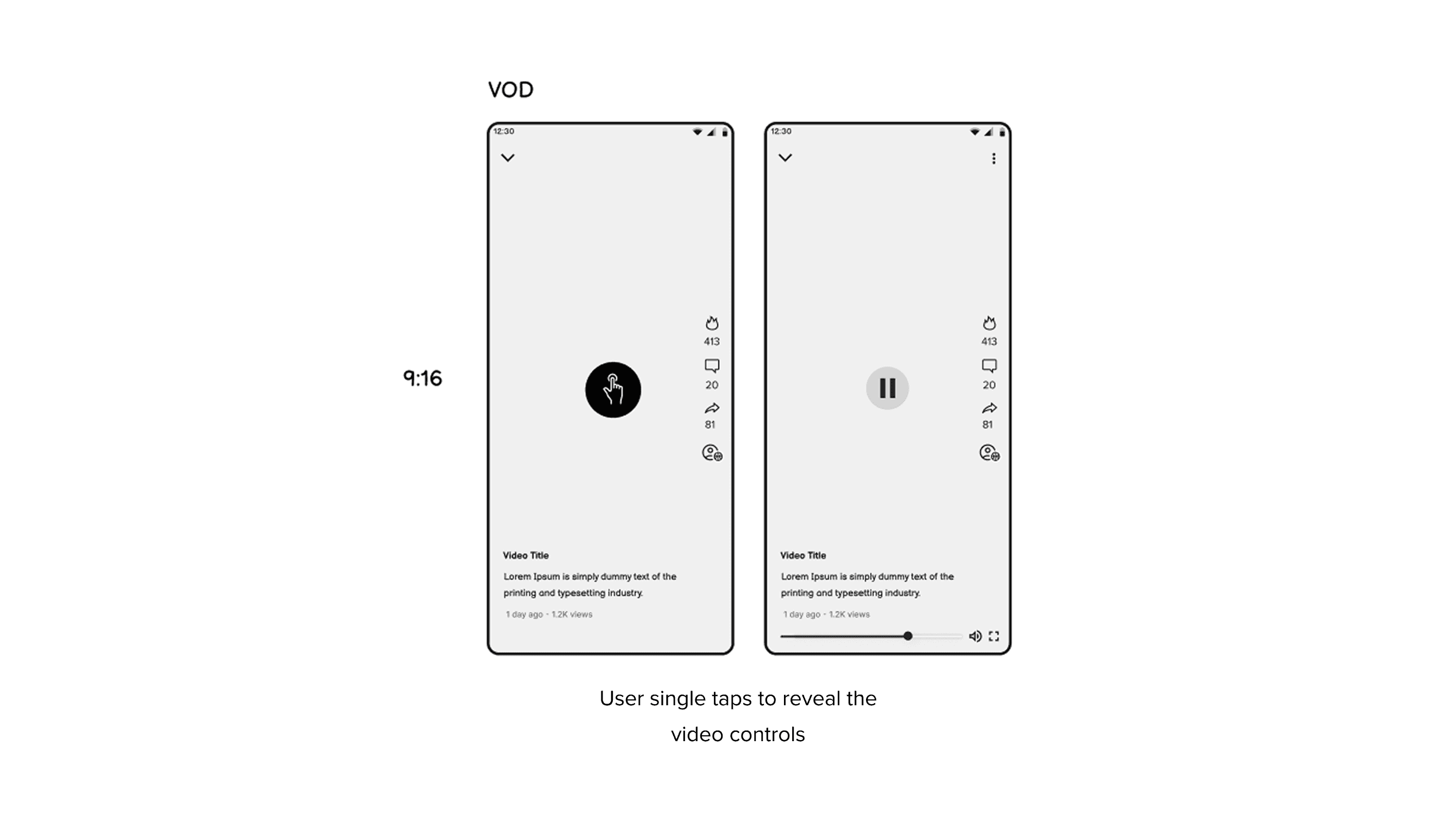
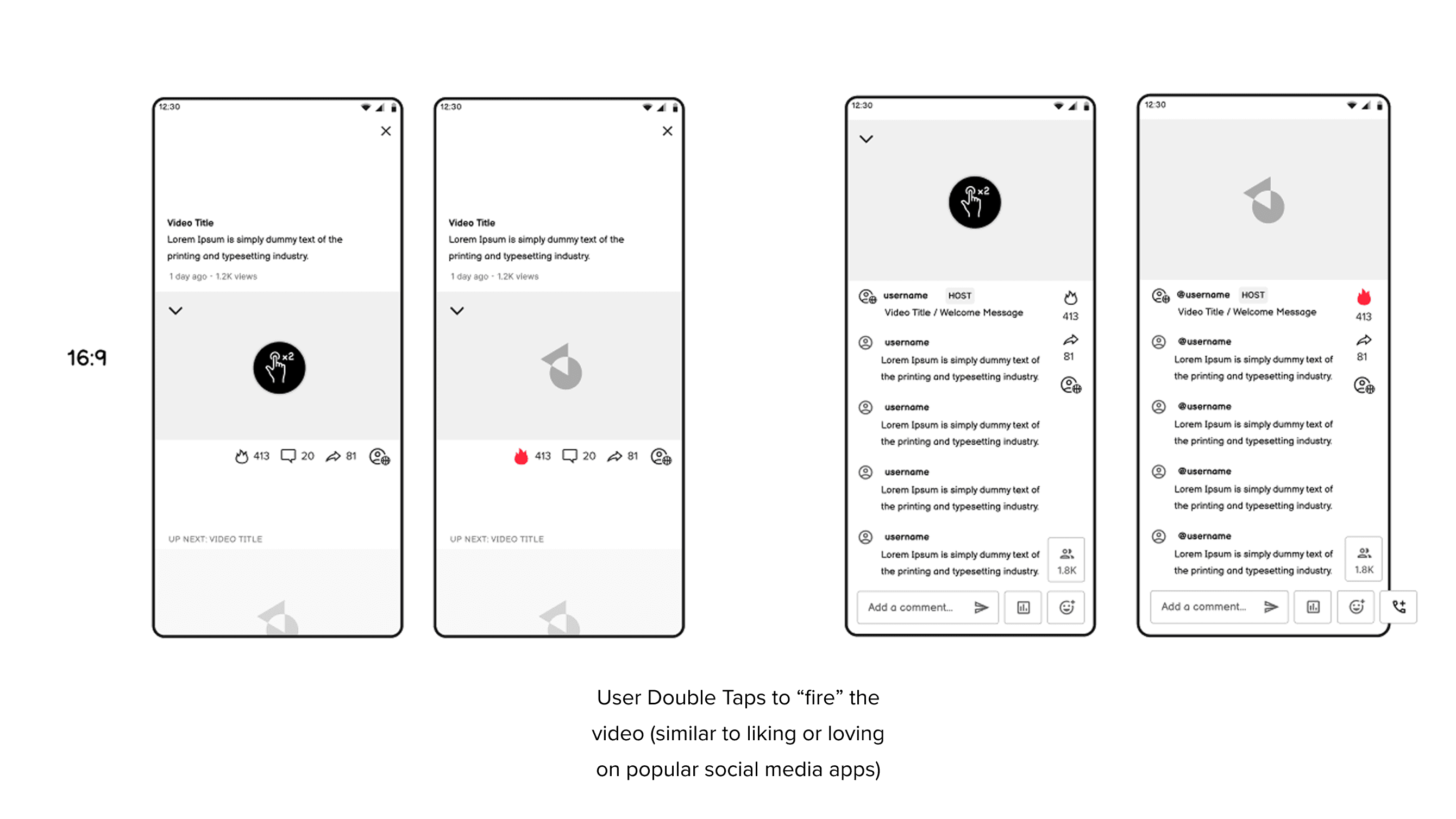
Now that we had the architecture of the experience established, I was able to go through and start refining screens, components and interactions through higher fidelity mocks and prototyping.
I started with horizontal video since it was the video type our app already supported and was 100% going to be needed for launch.
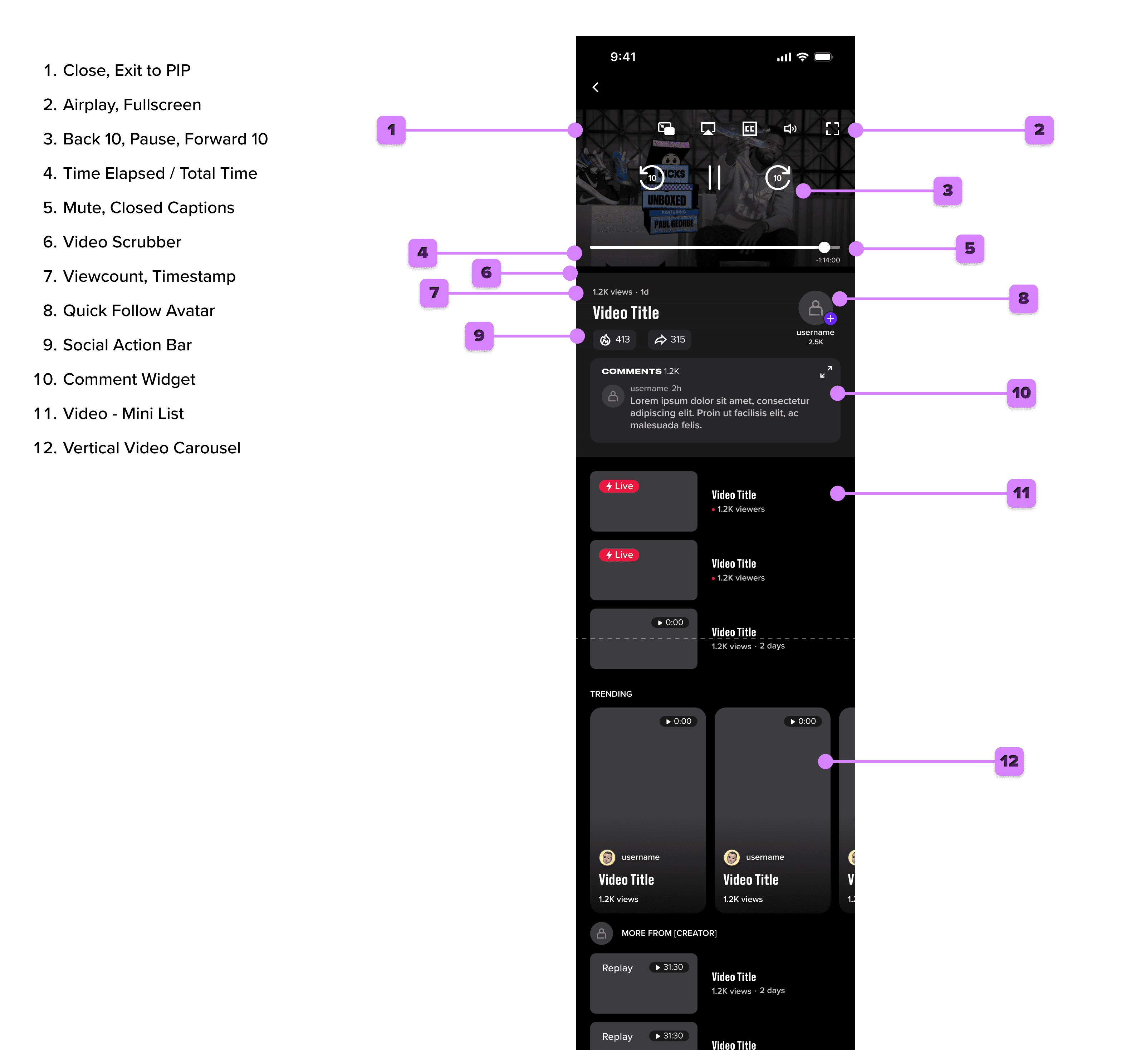
The Solution
We ran internal feedback rounds, then moved into high-fidelity prototypes that we tested before finalizing for engineering handoff.
The shipped experience introduced a unified video player architecture that maintained format context as users moved between content types. If you were watching vertical, you stayed in vertical. If you were in horizontal, the experience preserved that mode across content without interrupting you.
Live horizontal video brought full broadcast-style streaming to Bleacher Report for the first time, giving fans The Viewer Experience redesign shipped in early 2025 and delivered measurable improvements across the metrics that mattered most.
Time spent in-app increased, driven largely by longer viewing sessions on both live and VOD content. Social feature engagement, measured by reactions, comment interactions, and live chat participation, grew significantly as fans found new ways to experience games together.
The introduction of live vertical video opened up a new content surface that resonated strongly with younger fans who were already conditioned to that format from other platforms. And the social layer drove meaningful increases in ad revenue by creating more contextual moments within the viewing experience for brand integration.
Designing social features for a live video experience taught me that restraint is its own design skill. It's easy to add interactions. It's much harder to decide exactly when and how they appear so they feel earned rather than intrusive. The gesture-first approach we landed on, where features are available but not present by default, was the right call, but it took real conviction to advocate for it when early stakeholders wanted social features to be more prominent.
I also learned a huge amount about designing for context switching. Fans don't have a single way of watching; they move between formats, between devices, between social and passive modes throughout a single session. Designing an experience that respects those transitions rather than resetting them is one of the most valuable things you can do for user satisfaction, even if it's nearly invisible when you get it right.
Finally, this project solidified my belief that the best design work happens when you're in the room from day one. Having a design voice in product strategy conversations, not just in the executional phase, leads to better outcomes for users and makes the process more efficient for everyone.
TV-quality experience on their phones. Live vertical video created a completely new mode of live sports consumption, built for the immediacy and social energy of mobile-first viewers.
The social features, reactions, comments, live chat during live events, and video polls, were designed to layer on top of the viewing experience without ever competing with it. Reactions appear as an animated burst overlay during high-energy moments. Comments and live chat slide in from the edge on demand. Polls surface contextually during natural break points in live content.
Results & Impact
The Viewer Experience redesign shipped in early 2025 and delivered measurable improvements across the metrics that mattered most. Time spent in-app increased, social feature engagement grew significantly, and the introduction of live vertical video opened up an entirely new content surface that resonated with younger, mobile-first fans.
Time spent per session increased by 27% following launch.
Social feature engagement (reactions, comments, live chats) grew by 43%. We new it would be high with the addition of vertical video but this one was pleasantly surprising!
Lastly, where there is scrolling - there are ads… A necessary evil but also an easily changeable, living strategy using previously established components allowed for discrepency to be tested.
Ad revenue from social integration moments increased by 11%.
What I Learned
Social feature engagement was a lesson in deciding what was necessary for the improved experience and what was best design practice. It's easy to add interactions. It's much harder to decide exactly when and how they appear so they feel earned rather than intrusive. The approach we landed on was the right call, but it took real conviction to advocate for it.
I also learned a huge amount about designing for context switching. Fans move between formats, devices, and modes throughout a single session. Designing an experience that respects those transitions rather than resetting them is one of the most valuable things you can do for user satisfaction.
This project also reinforced my belief that the best design work happens when you're in the room from day one, contributing to product strategy, not just executional output. Staying involved in the engineering collaboration was key to deciding what was absolutely necessary for improvement of social on launch and what was design best practice that could be a fast follow during developmental iterations.